
Case study · UI/UX · Brand Identity · 2026
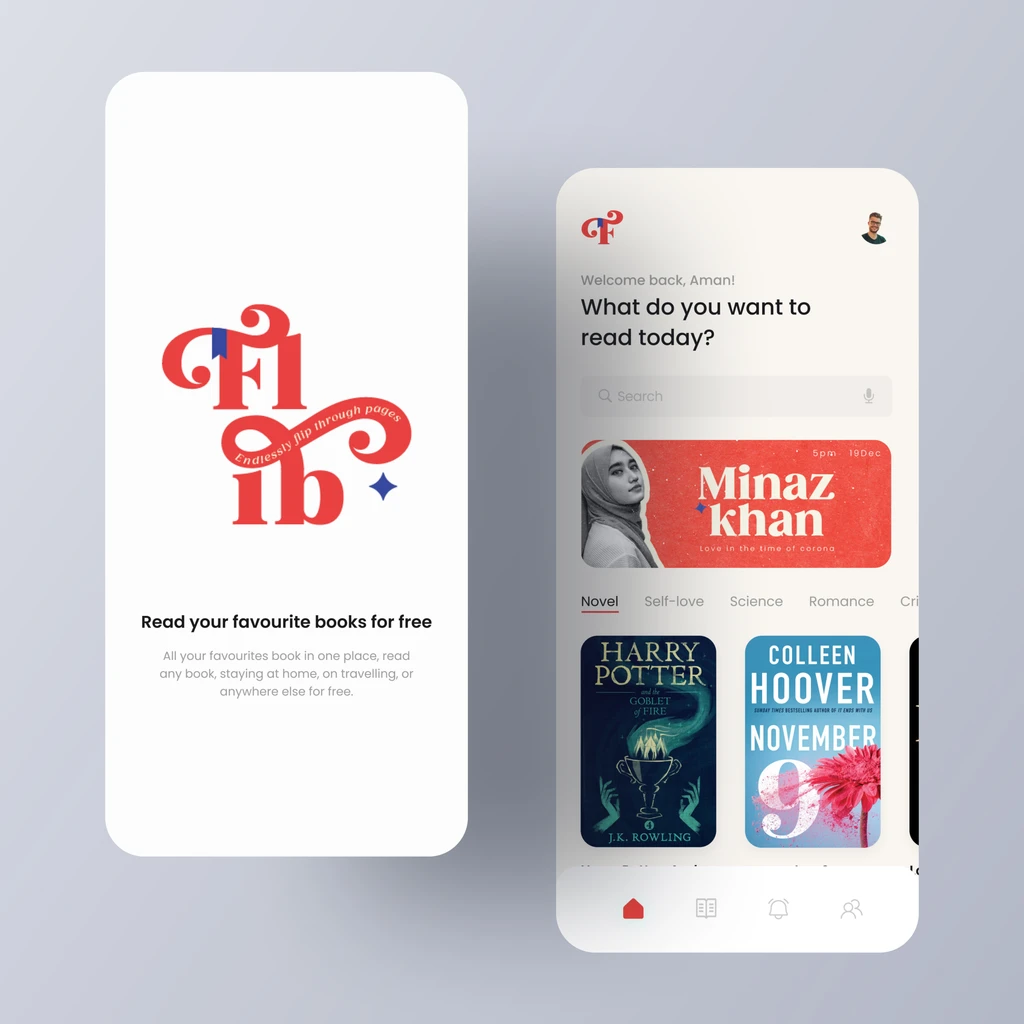
FLib App - brand and interface designed as one system
↔
BeforeAfterChallenge
The brand looked sharp in the deck and fell apart in the product. Colour, type and spacing were re-invented on each screen, so the app felt like a different company.
Approach
We designed identity and interface together: tokens for colour and type, a component library built from the brand grid, and motion rules that carry the same personality into the product.
Outcome
A design system the team ships from - the brand now survives contact with the UI, and new screens stay on-brand by default.
- Reusable components
- 40+
- Design-to-build handoff
- Tokenised
- Brand drift
- Eliminated